Call: 866-472-5376 Ext.111
Learn salesforce.com skills and best practices
Join today and get unlimited access to our library of salesforce.com video courses
Membership is FREE. Exclusive Offers Await You.

II. Creating and Editing Dashboards - Salesforce Dashboard Visualizations

Want to learn more about Salesforce Dashboards?
Visualize your business intelligence. Create Dashboards for all divisions including sales, marketing, and service. Understand what is going on quickly.
II. Creating and Editing Dashboards - Salesforce Dashboard Visualizations
Live Salesforce Training teaches you how to build effective dashboards. By providing the right dashboard components, the correct data, to the right people, you create a more enabling business environment. This drives the customer experience to the next level, thereby creating more customers for life.
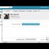
This tutorial will show you the basics of creating and editing a new Salesforce Dashboard. You will be creating a new dashboard layout, adding a dashboard component, and adding a data source of "leads created today" from our previous tutorial.
For demonstration purposes, we are in a Salesforce developer edition.
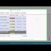
Click on the edit button to add and edit components for your dashboard. The panel on the left will show components and data sources. The right panel shows how your dashboard will be displayed to the user.
Let’s create a dashboard as an example.
We are going to take our report “leads created today” from one of our other report videos and add its own dashboard.
Let’s click on the “Go to Dashboard List” and then at the top click “new dashboard”. We now have a blank dashboard to begin our creation process.
To add a component you can chose the graph you want displayed in the left panel and then drag and drop it into a dotted line space in any column. We’ll select the gauge component for this example.
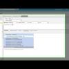
Then, click the data source tab and select the report from where you want to pull the data. We’ll use the quick find for our report “Leads created today.” Then drag and drop into an empty component. Now the report that we want to use gives us an error because you can only use Summery and Matrix reports for your dashboard components.
So open a new browser window and go to back into reports. Find your “leads created today report” and click customize. Near the Preview header you’ll see “Tabular Format.” Click on the arrow to see the dropdown to select the Summary Format. Then we will need a grouping field. For this particular report we’ll need the “create date” as our grouping field. So we quick search “Create date” and drag it into the grouping field area. Now click save.
Now, let us go back to our dashboard and drag over our leads created today data source, back into our component. You will now see the active component.
You can now use this graph to judge a quota for leads coming in today, but your quota will obviously be different from what Salesforce provides.
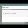
So, click on the settings button to see the formatting options. For Example let’s say you have a small business that only gets a few leads daily. We’ll have the minimum set to 0, the first breakpoint set to 2, the second breakpoint set at 5, and the maximum range at 10. We do not need it here, but you can also format the component data to display different units, as well as where to drill down when clicking the component. Most of the time, you will use the defaults. Click ‘Ok’ to save the formatting.
Reorder components by dragging and dropping. Edit headers, titles, and footers just by clicking on the area.
In a more advanced dashboard, you can add filters to your dashboard to refine the data to display. Setup correctly, you can create a single dashboard with one set of source reports to serve a wide audience.
One feature we do not want to overlook as an administrator is the “view this dashboard as” feature. Select a user to see the dashboard as it would be displayed to them. I see an error for this user which would generally be caused by permission settings.
Now save this dashboard. We’ll call it “my personal dashboard” for now and save it to my personal dashboards. After saving, it may take a few moments to generate.

- Vice president, SAP
- CEO, Kinamu.de
- GM, Incadea Russia & CEE
Newest Tutorials
|
4:45 Fundamental |
Sales Superhero - Stuck Opportunities Let's see an example of one of the tools you will be build in your class: Stuck Opportunities. Identify which opportunities are stuck in your pipeline with this report. Overcome objections and hurdles to move your opportunity to a closed sale. Close more deals, faster. |
|
4:07 Fundamental |
Marketing Superhero - Leads By Source Let's see an example of one of the reports you will be building in the class: Leads by source. Identify your lead sources and focus your marketing efforts accordingly. Determine the origin of leads. Track marketing efforts and stay on course. Use data to make informed decisions. |
|
6:15 Fundamental |
How to set up salesforce.com Mobile Lite Salesforce Mobile Lite is an easy two-step process to set up: Enable and Notify. We go through a comparison of the differences between Salesforce Mobile Lite and Salesforce Mobile Standard. |
|
3:39 Intermediate |
Facebook Conversations in Salesforce.com Learn to use Facebook with Salesforce to grow your business.Integrating Facebook with Salesforce can have a number of benefits including storing a post as a lead or contact, replying to and “Liking” a post right inside Salesforce. It all starts with pulling the conversation into Salesforce. |
|
3:30 Fundamental |
Salesforce Social Business for Client Engagements Social Accounts and Contacts are features in Salesforce that use Social Media to spark conversations and insights with your Leads, Accounts, and Contacts. |
trademarks of salesforce.com, inc. and are used here with permission.