Call: 866-472-5376 Ext.111
Learn salesforce.com skills and best practices
Join today and get unlimited access to our library of salesforce.com video courses
Membership is FREE. Exclusive Offers Await You.

I. Dashboard Introduction - Salesforce Dashboard Visualizations

Want to learn more about Salesforce Dashboards?
Visualize your business intelligence. Create Dashboards for all divisions including sales, marketing, and service. Understand what is going on quickly.
I. Dashboard Introduction - Salesforce Dashboard Visualizations
With Live Salesforce Training, spend more time making customers for life and less time searching for data. Dashboards provide you with the visual information you need, using underling reports.
This Salesforce tutorial will show you some basic about Salesforce Dashboards. It will introduce you to the terminology and navigating around dashboards.
As an example, we’re in a Salesforce developer account
Dashboards are the easiest way to see information in Salesforce. You can create a dashboard graph from a report that uses any of the standard or custom fields within your Salesforce instance. It must be built logically to show segmented results in summery or matrix reports.
Dashboards are graphs generated from existing reports. With Salesforce being intuitive, you can click on any of the graphs to drill down into the originating report. As you can see, this is a summary report that is segmented by the lead source type.
See how well your organization is performing with these graphs. Some examples of the kind of graphs you can create are:
- Top Sales Representative
- Lead Source Comparison
- Sales Pipeline Funnel
- Call Scripting Statistics
- Top performing Google keywords
- Quota gauges
- Calls by user
- And more!
The dashboards can be divided into categories of folders for easier management.
Be aware, your dashboard is not viewed in real-time. You have to manually refresh your dashboard by clicking the “Refresh” button, but Salesforce limits the refresh rate depending on your edition of Salesforce.
If you have enterprise or unlimited edition, you can schedule your dashboard to update daily, monthly, or weekly.
- Information Systems Manager
Newest Tutorials
|
4:45 Fundamental |
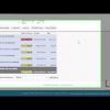
Sales Superhero - Stuck Opportunities Let's see an example of one of the tools you will be build in your class: Stuck Opportunities. Identify which opportunities are stuck in your pipeline with this report. Overcome objections and hurdles to move your opportunity to a closed sale. Close more deals, faster. |
|
4:07 Fundamental |
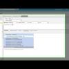
Marketing Superhero - Leads By Source Let's see an example of one of the reports you will be building in the class: Leads by source. Identify your lead sources and focus your marketing efforts accordingly. Determine the origin of leads. Track marketing efforts and stay on course. Use data to make informed decisions. |
|
6:15 Fundamental |
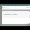
How to set up salesforce.com Mobile Lite Salesforce Mobile Lite is an easy two-step process to set up: Enable and Notify. We go through a comparison of the differences between Salesforce Mobile Lite and Salesforce Mobile Standard. |
|
3:39 Intermediate |
Facebook Conversations in Salesforce.com Learn to use Facebook with Salesforce to grow your business.Integrating Facebook with Salesforce can have a number of benefits including storing a post as a lead or contact, replying to and “Liking” a post right inside Salesforce. It all starts with pulling the conversation into Salesforce. |
|
3:30 Fundamental |
Salesforce Social Business for Client Engagements Social Accounts and Contacts are features in Salesforce that use Social Media to spark conversations and insights with your Leads, Accounts, and Contacts. |

trademarks of salesforce.com, inc. and are used here with permission.